3D infographics are the most popular creative trends to remain in the mainstream this year. Among all other charts and visualization design trends in 2019, this particular design concept is increasingly becoming the benchmark today and companies are using these visualization to represents the numbers in Dashboard and Reports.
Dashboard designers are continuously exploring modern ideas to meet the needs of their target audience. As Infographics has both the visual and textual elements, it convey the strong message to audience and leave the good impact due to beautiful design of charts.
In this post, we are going to discuss a simple but very beautiful 3d Column Infographics. In this chart, we will show the Zonal Sales Performance comparing with actual sales vs target sales %.
The best part of this chart is it has been made in Excel and totally dynamic. Hence, you don’t need to create this chart again and again. You need to just change the underlying dataset and this infographics will get updated accordingly.
Below is the snapshot of 3D Column Infographics.
3D Column Infographics
Let’s create this chart.
Open Excel file and Save as Infographics
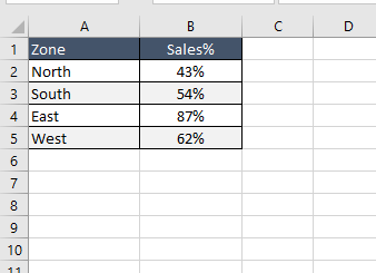
Prepare the sales raw data
Raw Data
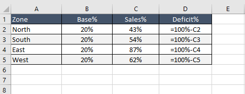
As above data has only sales performance, we need to add two more columns to this dataset to show the deficit% as well as the bottom part of this infographics i.e. Category Name
Insert two more columns in the actual raw data set 1. Base% in Column B and 2. Deficit% in Column D
Enter 20% in Column B for Base%
In Column D, enter the formula =100%-C2 in Cell D2 and then replicate the same formula in other cells for all three remaining Zone
Your final data will look like below one
Updated Raw Data – Formula View
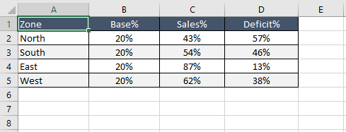
Updated Raw Data – Value View
Now select the data range B2:D4 (don’t select the header part) – Point 1 in below snapshot
Go to Insert Table – Point 2 in below snapshot
Click on Column Chart under Chart group – Point 3 in below snapshot
Select the 3D Stacked Column chart – Point 4 in below snapshot
Steps to create chart
Once you will select the chart then a 3D Stacked Column chart will available on sheet
Now select the chart (step 1 in below image) and got to Format Tab (step 2 in below image) and then change the chart size Height – 3.39 and Width – 6.04 (step 3 in below image)
Resizing the Chart
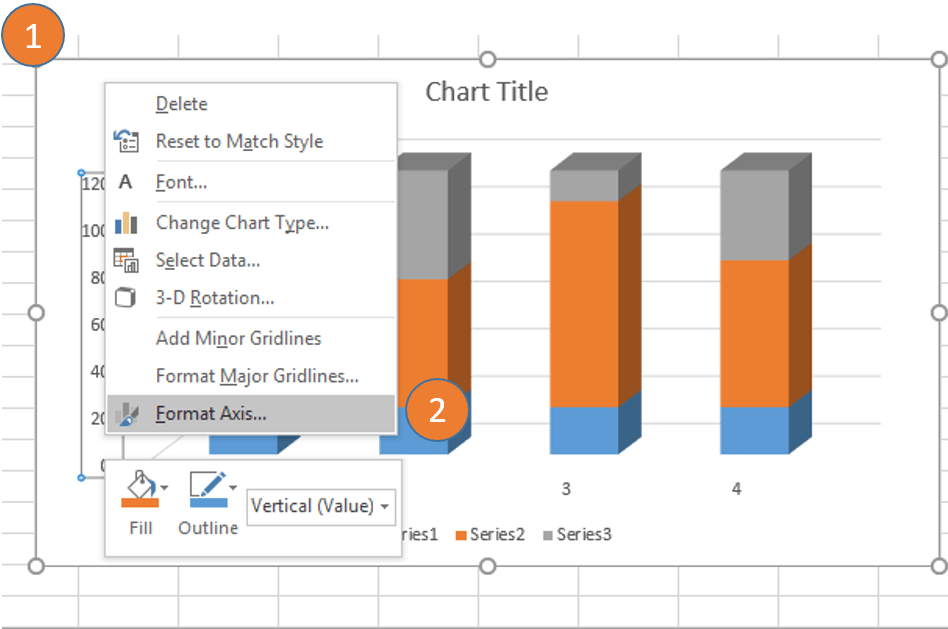
Select the Chart (Step 1 in below image) and Right Click on Axis (Step 2 in below image)
Format Axis
Now go to Format Axis pane and change the Minimum to 0 and Maximum to 1.2 under Bound in Axis Option
Axis Size
Now close the Format Axis pane
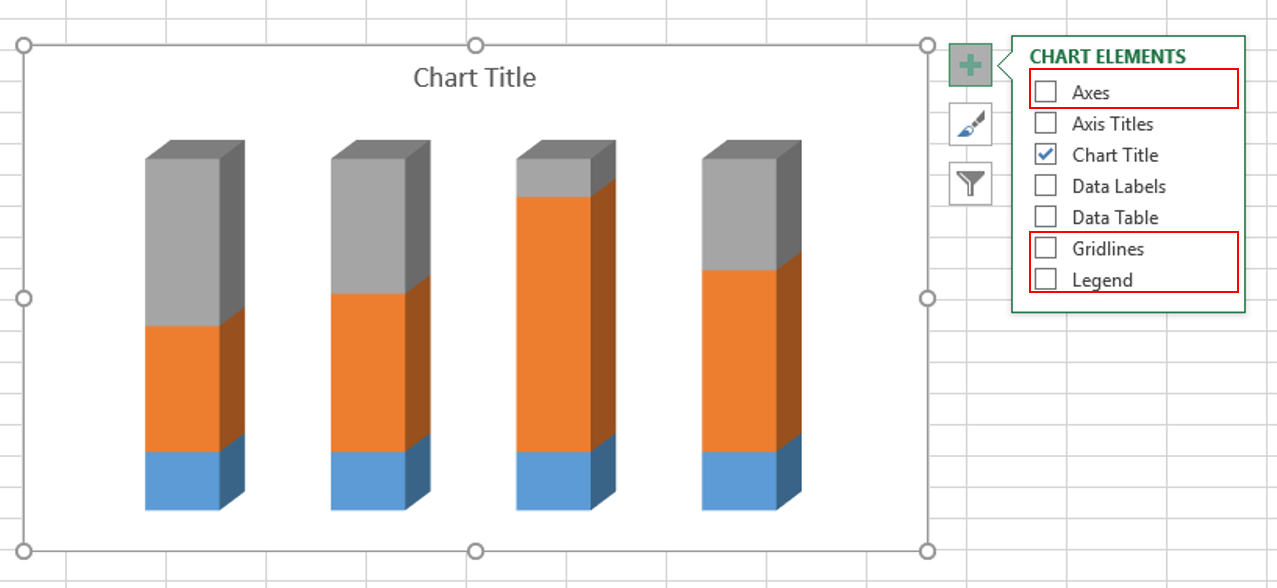
Select the Chart and remove the Axes, Gridlines and Legend from the Chart
To remove all these, just select the chart and then click on Plus (+) then uncheck the Axes, Gridlines and Legen in Chart Elements Pop-up window (please see the below image)
Remove Axes, Gridlines and Legend
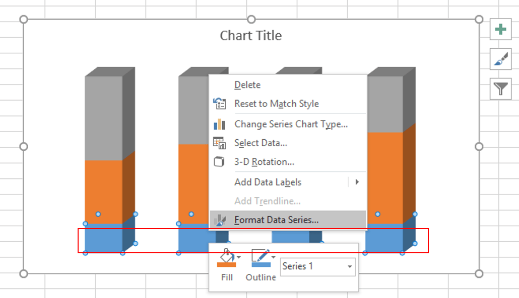
Now format the Base% (blue color series) in above chart
To format the bottom series, select the series then right click on it and then select ‘Format Data Series’
Format Data Series – Base%
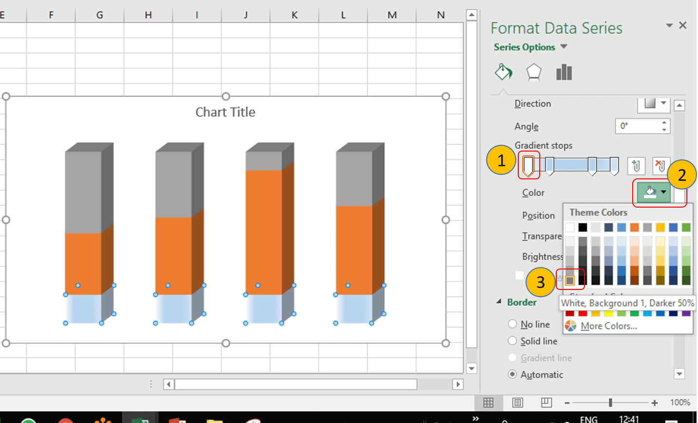
In ‘Format Data Series’ pane, just click on Fill & Line (step 1 in below image) then select the Fill (follow step 2 in below image) -> Gradient Fill (refer step 3 in below image) – > Select ‘Type’ as ‘Linear’, ‘Angle’ as 0 (follow the step 4 in below image)
Gradient Fill Options
Create 4 Gradient Stops – 1st at 0%, 2nd at 25%, 3rd at 75% and 4th one is at 100%
Gradient Stops Position
Now, change the color of each Gradient Stops
Select the first gradient stop (step 1 in below image) – > Click on Color (step 2 in below image) -> Select the color as ‘White Background 1, Darker 50%'(step 3 in below image)
Changing color of first Gradient Stop
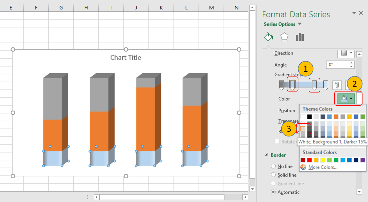
Select the second and third gradient stop separately (step 1 in below image) – > Click on Color (step 2 in below image) -> Select the color as ‘White Background 1, Darker 15%'(step 3 in below image)
Changing Colors of Second and Third Gradient Stops
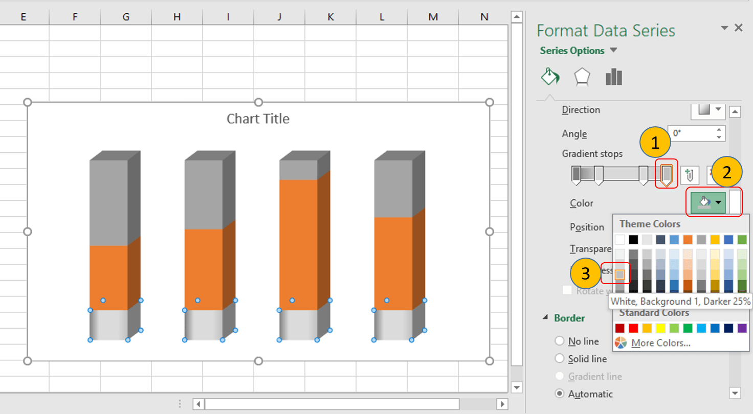
Select the fourth gradient stop (step 1 in below image) – > Click on Color (step 2 in below image) -> Select the color as ‘White Background 1, Darker 25%'(step 3 in below image)
Changing color of 4th Gradient Stop
Now change the formatting of Sales% series with different colors
Click on the Sales% series then right click on it and then select ‘Format Data Series’
In ‘Format Data Series’ pane, just click on Fill & Line then select the Fill -> Gradient Fill – > Select ‘Type’ as ‘Linear’, ‘Angle’ as 0
Create 3 Gradient Stops – 1st at 0%, 2nd at 24% and 3rd at 100%
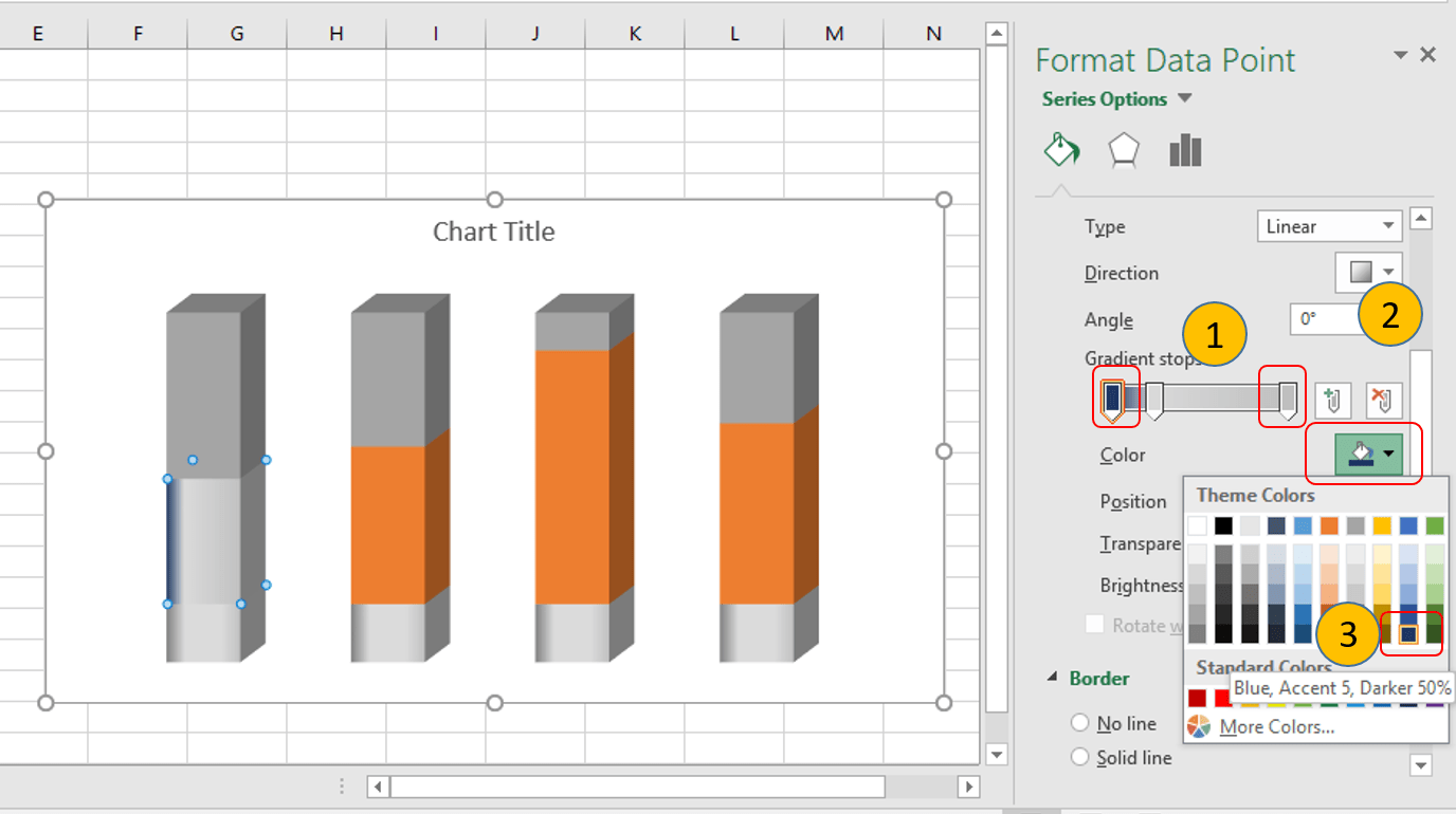
Select the first and third gradient stop separately (step 1 in below image) – > Click on Color (step 2 in below image) -> Select the color as ‘Blue Accent 5, Darker 50%'(step 3 in below image)
Changing Gradient Color of Sales% Series
Select the second gradient stop (step 1 in below image) – > Click on Color (step 2 in below image) -> Select the color as ‘Blue Accent 5, Darker 25%'(step 3 in below image)
Changing Color of 2nd Gradient Stop
Repeat the above two steps for next 3 Sales% series.
For 2nd Sales% series, Select the first and third gradient stop separately – > Click on Color -> Select the color as ‘Green Accent 5, Darker 50%’
Select the second gradient stop – > Click on Color -> Select the color as ‘Green Accent 5, Darker 25%’
Changing the Gradient Fill of Second Series
For 3rd Sales% series, Select the first and third gradient stop separately – > Click on Color -> Select the color as ‘Orange Accent 5, Darker 50%’
Select the second gradient stop – > Click on Color -> Select the color as ‘Orange Accent 5, Darker 25%’
Changing the Gradient Fill of Third Series
For 4th Sales% series, Select the first and third gradient stop separately – > Click on Color -> Select the color as ‘Gold Accent 5, Darker 50%’
Select the second gradient stop – > Click on Color -> Select the color as ‘Gold Accent 5, Darker 25%’
Changing the Gradient Fill of Fourth Series
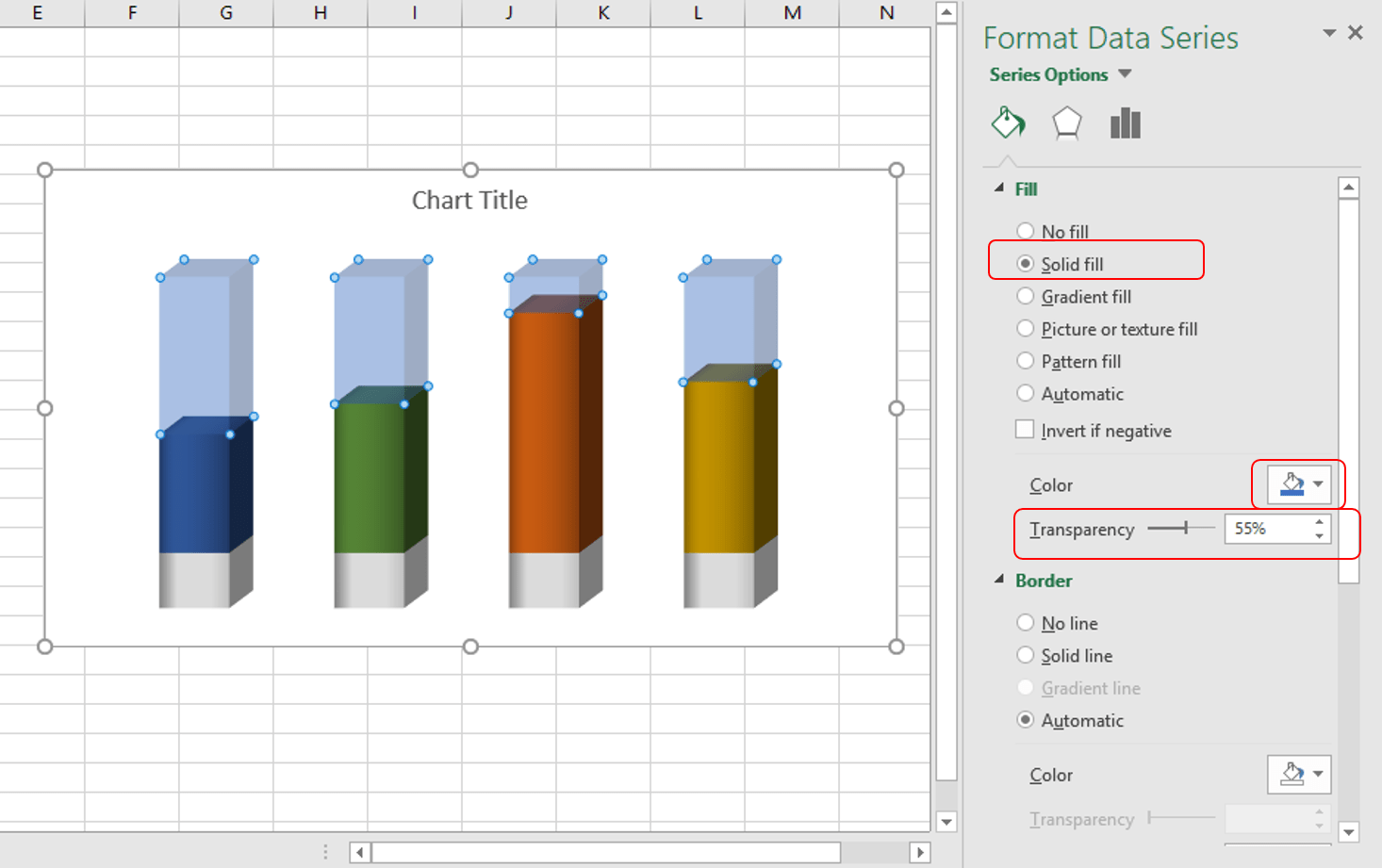
Now select the Top Series (Deficit%) then go to ‘Format Data Series’ pane -> Click on Fill & Line -> Solid Fill – > Select the color as ‘Blue Accent 5’ -> Change the transparency from 0 to 55%
Changing the Fill Color of Deficit% Series
Select the second Deficit% series then Change the color from ‘Blue Accent 5’ to ‘Green Accent 6’
Changing the Fill color of 2nd Deficit% Series
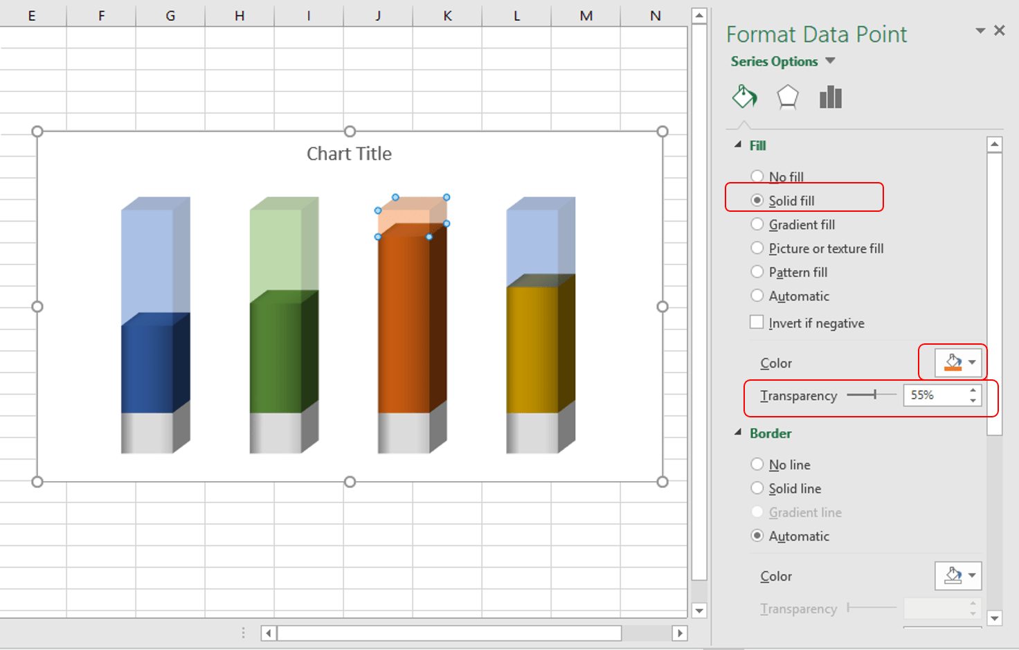
Select the third Deficit% series then Change the color from ‘Blue Accent 5’ to ‘Orange Accent 2’
Changing the Fill color of 3rd Series of Deficit%
Select the fourth Deficit% series then Change the color from ‘Blue Accent 5’ to ‘Gold Accent 4’
Changing the Fill color of 4th Series of Deficit%
Change the chart title to “Zonal Sales Conversion YTD – 2018”. Select the Font name as ‘Copperplate Gothic Bold’ and Font size to 14
Changing the Chart Title
Now right click on bottom series -> Click on Add Data Labels->Add Data Labels
Adding Data Labels
Right click on bottom series and select ‘Format Data Labels’
Format Data Labels
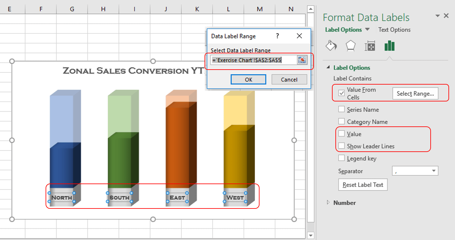
Go to ‘Format Data Labels’ -> Tick the ‘Value From Cell’ then click on Select Range and provide the range as $A$2:$A$5 -> Untick the ‘Value’ and ‘Show Leader Line’ -> Select the Font name as ‘Copperplate Gothic Bold’ and Font size to 9
Changing Data Labels
Right click on middle series (Sales%) -> Click on Add Data Labels->Add Data Labels
Add Data Labels
Right click on middle series (Sales%) and select ‘Format Data Labels’
Format Data Labels
Go to ‘Format Data Labels’ -> Tick the ‘Value From Cell’ then click on Select Range and provide the range as $C$2:$C$5 -> Untick the ‘Value’ and ‘Show Leader Line’ -> Select the Font name as ‘Copperplate Gothic Bold’, Font size to 11 and Font color ‘White’
Select Data Range
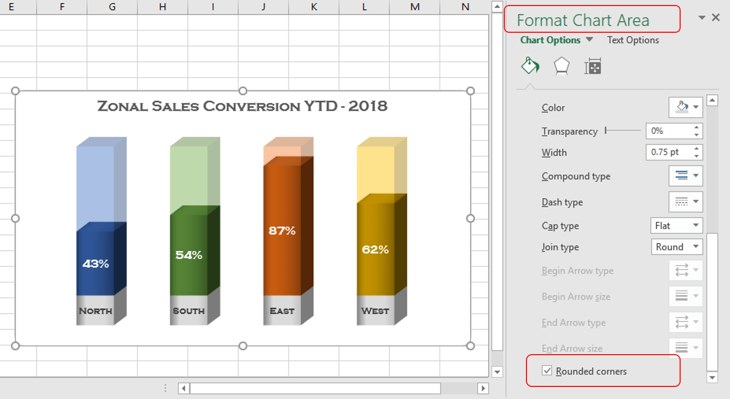
Select the Chart -> Go to ‘Format Chart Area’ pane -> Select the ‘Rounded Corners’
Apply Rounded Corners
Close the ‘Format Chart Area’ pane
Remove Gridlines from the sheet. To do this, just click on View Tab -> Untick the ‘Gridlines’ option under ‘Show’ group
Remove Gridlines
Save the Excel File. Now, 3d Infographics Column chart is ready
We use cookies to ensure that we give you the best experience on our website. If you continue to use this site we will assume that you are happy with it.OkPrivacy policy


")
