Table of Contents
Introduction – Call Center Performance Dashboard in Excel
Welcome to the dynamic world of customer service, where call centers play a crucial role in managing interactions and shaping the customer experience. In the journey to improve this essential function, organizations often rely on the Call Center KPI Performance Dashboard. This blog is your guide, walking you through the purpose, layout, key performance indicators (KPIs), and the nuances of each dashboard page. Our goal is to empower you with the knowledge to unveil valuable insights and enhance the efficiency of your call center operations.
What is a Call Center Dashboard?
A Call Center Dashboard is a visual representation of key performance indicators (KPIs) and metrics, offering instant insights into a call center’s performance. Think of it as a hub that brings together different data points in a user-friendly way, allowing for quick analysis and smart decision-making. This impactful tool plays a crucial role in monitoring, evaluating, and optimizing various aspects of call center operations.
Picture a well-crafted call center dashboard as the control center for all your key metrics. It empowers both agents and managers to promptly address and resolve any issues that come up. It’s not just a display; it’s a dynamic performance management tool that keeps your finger on the pulse of your call center, ensuring efficient and responsive operations.
Why Do We Need a Call Center Dashboard?
- Data-Driven Decision-Making: Dashboards offer a centralized location for critical information, allowing managers to make informed decisions based on real-time data.
- Performance Optimization: By tracking key metrics, call center dashboards help identify areas for improvement, optimize processes, and enhance overall efficiency.
- Resource Allocation: Efficient allocation of resources, such as staffing during peak call times, is made possible by understanding call volume patterns.
- Customer Satisfaction: Monitoring customer-centric metrics like CSAT and NPS enables prompt responses to customer needs, fostering higher satisfaction levels.
Why use a Call Center Performance Dashboard in Excel?
In the world of data, MS Excel stands out as a powerful platform for working with and visualizing information using graphs, tables, and visuals. It’s readily accessible on almost all computers, making it a user-friendly tool without the need for advanced IT skills, and it comes at no extra cost. MS Excel Dashboards prove invaluable when evaluating the call center performance of key metrics over time, providing a simple and effective solution.
Call Center Dashboard Excel Example
Here’s how the call center performance dashboard in Excel looks:
KPIs in Call Center Performance Dashboard in Excel
Within the call center environment, it’s good to incorporate metrics that can swiftly change, directly influencing service levels. While KPIs may vary across industries, each call center should establish a foundational set of essential metrics to consistently monitor and track the performance. However, below is the list of essential metrics that every call center must track to ensure effective call center performance management:
- Total Calls – The overall count of calls that your call center receives.
- Calls Answered – The number of calls that were successfully picked up by agents.
- Abandon Rate – The percentage of calls that were abandoned by callers before being answered.
- Call Resolution % – The percentage of calls successfully resolved by agents.
- Average Speed of Answer (ASA) – The average time it takes for calls to be answered by agents.
- Average Handle Time (AHT) – The average duration agents spend on handling a call from start to finish.
- Net Promoter Score (NPS) -A metric gauging customer loyalty and satisfaction.
- Customer Satisfaction Score (CSAT) – A measure of customer satisfaction based on their feedback.
Structure of the Contact Center Dashboard Excel
The Call Center KPI Performance Dashboard is carefully organized, with different sheets focusing on various aspects of call center performance. These sheets include:
- Executive Dashboard: Provides a high-level overview of critical metrics.
- Department Performance: Delves into department-level metrics for focused analysis.
- Team Performance: Examines performance at the team level, aiding team leaders in optimizing contributions.
- Weekly Performance: Offers a detailed breakdown of performance trends every week.
- Support Sheet: Functions as a support system, housing raw data and calculations for dashboard creation.
- Raw Data Feed: Contains complete raw data for this dashboard which includes essential call center metrics such as calls assigned, handled, abandoned, resolutions, and more.
- Metrics Reference: Provides a handy reference for all metrics used in the dashboard, along with their calculations and corresponding DAX formulas.
Understanding Call Center Performance Dashboard in Excel
The Call Center Performance Dashboard has 4 different pages Executive Dashboard, Department Performance, Team Performance, and Weekly Performance. All these pages help organizations to analyze data at different levels and manage the call center KPIs performance effectively.
If you’re interested in learning how to create Sales Dashboard in Power BI, you can read Sales Dashboard in Power BI.
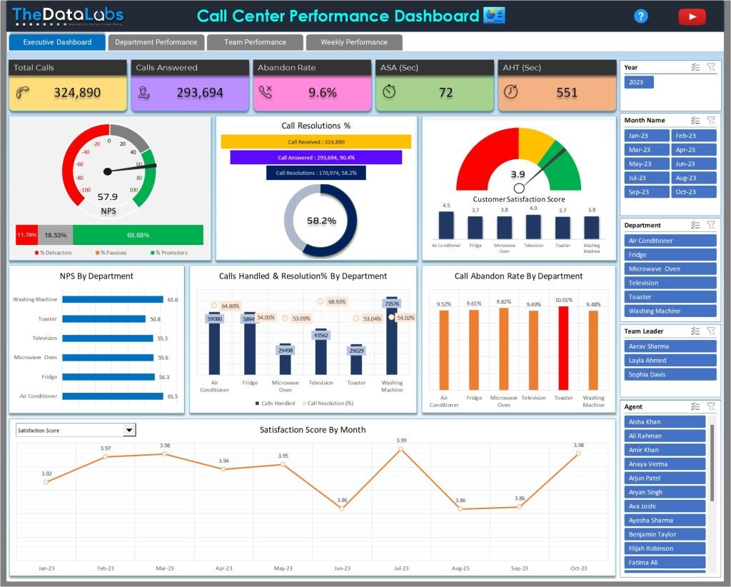
Executive Dashboard in Call Center Reporting Dashboard
The Executive Dashboard serves as the primary landing page, offering an overarching view of critical call center KPIs. It enables executives and managers to make informed decisions by providing real-time insights into the overall performance of the call center.
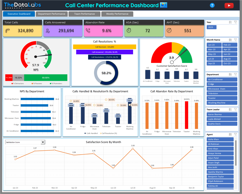
Various elements in the Executive Dashboard are carefully structured & beautifully presented to make the dashboard attractive, user-friendly and full of insights. These include the Header, TABs, Tiles, NPS Speedometer, Stacked Bar Chart, Funnel Charts, Doughnut Chart, CSAT Speedometer, Bar Chart, Combo Chart, Column Chart, Line Chart, and Slicers. Please see how all the elements are placed in Executive Dashboard page for easy data analysis.
At the top, there’s a header displaying the dashboard title, TheDataLabs logo, YouTube logo, and a Help Icon for easy access to the Metrics Reference page.

Below the header, there are four tabs: Executive Dashboard, Department Performance, Team Performance, and Weekly Performance. Users can click on these tabs to navigate through different pages of the dashboard.

Directly below the tabs, five beautiful tiles showcase overall call center KPI performance, including Total Calls, Calls Answered, Abandon Rate, ASA (Sec), and AHT (Sec). Each tile comes with clear headers and icons.

Below the tiles from the left of the screen, there’s an attractive Speedometer chart displaying the Net Promoter Score (NPS) with color-coded indicators for Detractors, Passives, and Promoters. Beneath the NPS Speedometer chart, there’s a bar stack chart illustrating the percentage breakdown of % Detractors, % Passives, and % Promoters.
Learn how to create Speedometer Chart in MS Excel.

Adjacent to the NPS section, a Funnel Chart depicts calls received, calls answered, and Call Resolutions. Immediately below that, a Doughnut Chart visualizes the Call Resolution %.

Continuing to the right of the Call Resolutions Funnel Chart, there’s another Speedometer chart showcasing the Customer Satisfaction Score (CSAT). Additionally, a mini-column chart beneath the speedometer visualizes the CSAT scores by department.

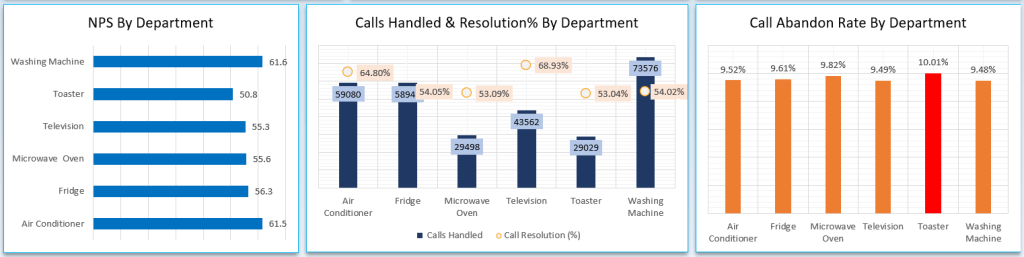
In the subsequent line of graphs and from the left, a Bar Chart shows the NPS Score by Department name of the call center. Right beside it, a Combo Chart offers a visual representation of Call Handled and Resolutions % by Department, where bars represent call-handled data, and lines depict resolution percentages.
Following this graph and concluding this row, a Column Chart comes into view, showing the Call Abandon rate by Department and highlighting the top abandoned % through red color.
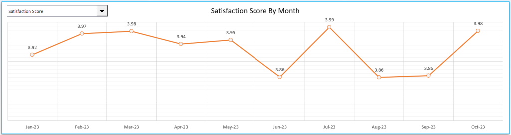
In the next line, a Trend Analysis chart provides insights into the call center performance across all metrics every month. There is a metrics drop-down positioned at the top left corner of the Trend Line Chart. The metrics drop-down chart allows users to select specific KPIs from the list and see how the metric is trending month over month in the line chart.
On the right side of the screen, alongside all the visuals, several Slicers are available, including Year, Month Name, Department, Team Leader, and Agent. These slicers serve as helpful tools to filter the report, enabling you to explore Call Center KPI performance at different levels.

Department Performance in Call Center Reporting Dashboard
On the Department Summary page, we’ve maintained the same structure as the Executive Dashboard with the Header, Tabs, Cards, and slicers. Since this page focuses on departmental performance, there’s a column chart positioned below the Cards on the left side of the screen. It displays the performance of KPIs categorized by department name. At the top left corner of the chart, there’s a metrics drop-down, allowing users to choose a specific KPI and view its performance by department.
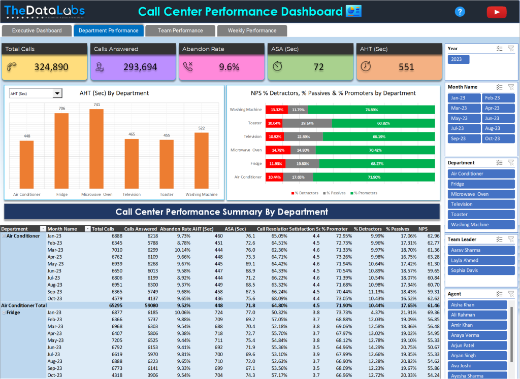
Adjacent to this column chart, there’s a bar chart depicting the performance of %Detractor, % Passives, and % Promoters in a stacked bar chart format, organized by department. Below these two charts, a pivot table provides a comprehensive view of Call Center KPI performance, categorized by both Department and Month.
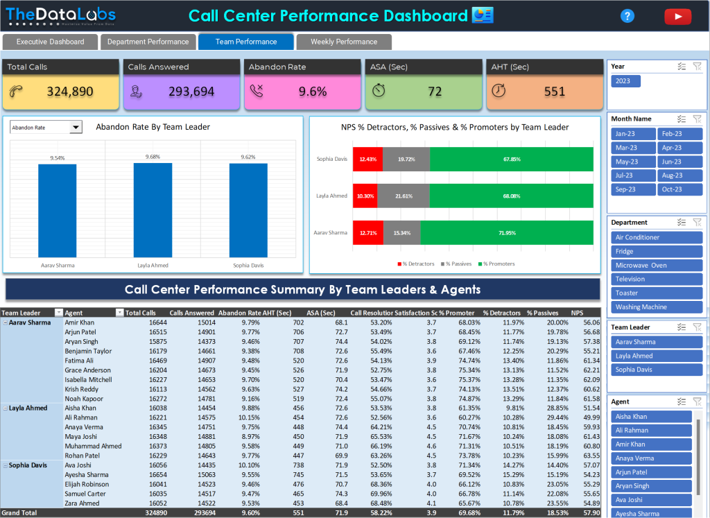
Team Performance in Call Center Reporting Dashboard
The Team Performance page is specifically designed to display KPI performance at the team level in the call center. The layout of this page resembles the Department Performance page. The key difference is that, here, we showcase performance based on Team Leaders rather than departments. In the Pivot table, we present the call center performance breakdown by Team Leaders and Agents. So, this page provides the Agent Performance Report as well.
Weekly Performance in Call Center Reporting Dashboard
In the Weekly Performance page, Header, Tabs, Cards, and slicers are as it is the way we have structured in the Executive dashboard and other pages. As this is the Weekly performance page, we have a Pivot Table below the Cards showing the performance of all the metrics by Week Ending.

If you’re interested in learning how to create Sales Dashboard in Microsoft Excel, you can read Dynamic Sales Performance Dashboard in Excel.

Conclusion and Download Instructions
In conclusion, the Call Center KPI Performance Dashboard is a strategic tool for call center management. It provides actionable insights for enhanced decision-making. By connecting this dashboard to an actual data source, it can function as a real-time call center dashboard, helping businesses manage their contact center performance effectively and efficiently.
Elevate your contact center efficiency with the best Contact Center Dashboard Excel solution. To experience the power of this performance dashboard, purchase the Excel Dashboard template at a nominal cost.


Hi, I purchased this. How can I get the file? Thank you.
Hello Kristine, You would have received email with attachment link.