Table of Contents
Introduction – Comparative Sales Analysis (Sales vs. Target Dashboard in Microsoft Excel)
In the fast-paced world of business, staying ahead requires not just insights but actionable insights for the sales data. One powerful tool to achieve this is a Comparative Sales Analysis Dashboard. In this walkthrough, we’ll explore the systematic steps of creating an interactive and informative Sales Dashboard in Microsoft Excel, designed to showcase the Sales vs. Target Dashboard in Microsoft Excel by Year, Month, Product Category and Product Name.
YouTube Tutorial – A step-by-step walkthrough of Comparative Sales Analysis Dashboard

Want to develop a Dynamic Sales Performance Dashboard in Excel. Read this.
Dynamic Sales Performance Dashboard in Excel with 5 and more Visuals – TheDataLabs
Comparative Sales Analysis Dashboard Structure
This Comparative Sales Analysis Dashboard has 5 different Sheets:
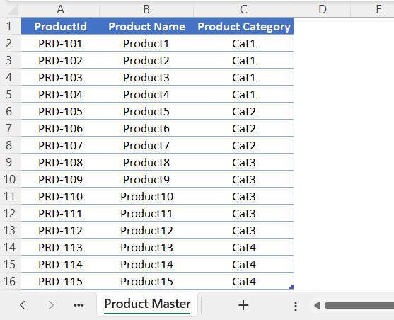
Product Master: This sheet contains the Product table with columns ‘Product ID’, ‘Product Name’ and ‘Product Category’. This table is being used as a dimension table in Power Pivot Data Modelling.
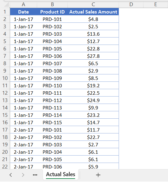
Actual Sales: In the ‘Actual Sales’ sheet, we have a sales table with columns ‘Date’, ‘Product ID’ and ‘Actual Sales Amount’. This sheet contains the actual sales amount by ‘Date’ and ‘Product ID’ and we are using this as a Fact table in Power Pivot Data Modeling.
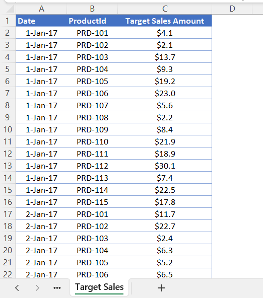
Target Sales: In the ‘Target Sales’ sheet, we have a target sales table with columns ‘Date’, ‘Product ID’ and ‘Target Sales Amount’. This table is being utilized as Fact Table in Power BI Data Modeling.
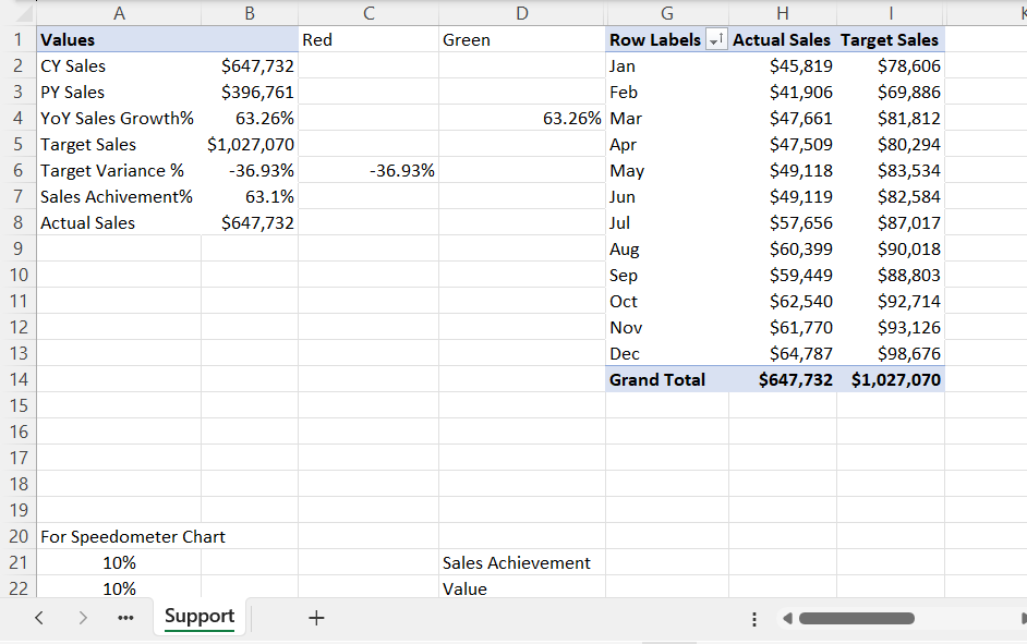
Support: This ‘Support’ sheet is for internal purposes only. We have created several tables and summaries which work as support data for charts, tables, and visualizations available on the ‘Dashboard’ sheet. We will discuss ‘Support’ sheet in detail after understanding the Data Model and Calculation in Power Pivot.
Dashboard: This is the main report where we have created several Cards, Charts, Graphs, Table and Slicers to show the sales summary and insights. We will cover Dashboard sheet in details post understanding the Data Model and KPI calculation in Power Pivot.
Understanding Data Model and Metrics Calculation for Comparative Sales Analysis Dashboard
In this section, we will understand the Data Model, Relationships and Metrics calculation for Comparative Sales Analysis Dashboard in Excel.
Interested to Develop Sales Dashboard in Power BI. Read this blog.
Sales Dashboard in Power BI with 3 Steps – Dynamic and Interactive – TheDataLabs
Loading and Creating Tables for Comparative Sales Analysis Dashboard
‘Product Master’, ‘Actual Sales’ and ‘Target Sales’ tables are the required tables to create data modeling in Power Pivot for this Sales Vs. Target Dashboard in Microsoft Excel.
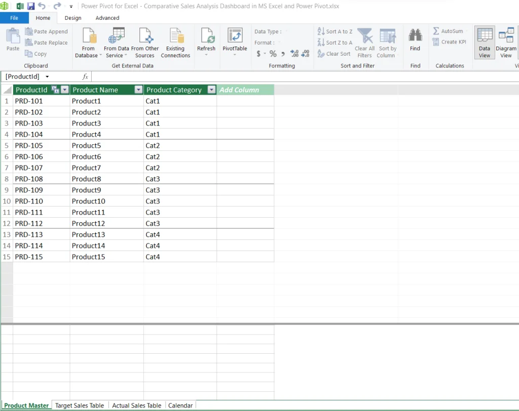
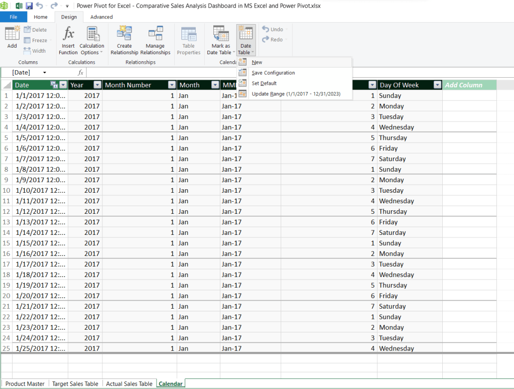
In Power Pivot, we have loaded ‘Product Master’, ‘Target Sales’ and ‘Actual Sales’ Tables from this file. In addition to these tables, we have created a ‘Calendar’ table using ‘Date Table’ features available in ‘Design Tab’ after selecting the date range as per dates available in Sales Tables.
After creating the ‘Date’ table, we inserted calculated columns ‘Year’, ‘Month Number’, ‘Month’, ‘MMM-YYYY’, ‘Day of Week Number’, ‘Day of Week’ using DAX formulas.
Data Modeling in Power Pivot for Comparative Sales Analysis Dashboard
In Power Pivot ‘Diagram View’, ‘Product Master’ and ‘Calendar Tables’ are dimension tables where ‘Target Sales’ and ‘Actual Sales’ are fact tables. We have created a relationship between Calendar Table, Target Sales and Actual Sales using the date field as one-to-many. Similarly, we have created a relationship between ‘Product Master’, ‘Target Sales’ and ‘Actual Sales’ using ‘Product ID’ column as one-to-many.
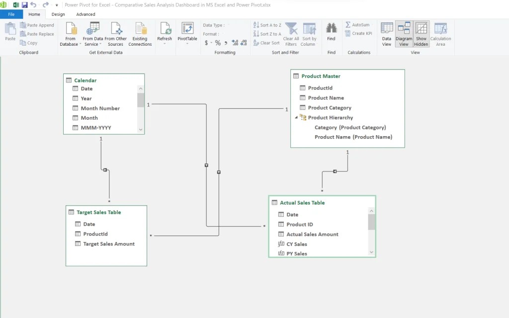
After creating a data model in Diagram view, we have calculated several KPIs in Data ‘View’ in ‘Actual Sales’ table.
Metrics Calculation in DAX for Comparative Sales Analysis Dashboard
Below are the list of metrics or KPIs we have created for this Sales vs. Target Dashboard in Microsoft Excel using DAX:
CY Sales: This metric computes the total sales amount for the current year.
CY Sales:=VAR CY =
    MAX ( 'Calendar'[Year])
RETURN
    CALCULATE ( SUM ( 'Actual Sales Table'[Actual Sales Amount]), 'Calendar'[Year] = CY )
PY Sales: This is to calculate the previous year’s sales amount.
PY Sales:=CALCULATE([CY Sales],SAMEPERIODLASTYEAR('Calendar'[Date]))
YoY Sales Growth%: This figure represents the percentage growth in sales year over year, comparing the current year’s sales to the previous year’s.
YoY Sales Growth%:=DIVIDE([CY Sales]-[PY Sales],[PY Sales],BLANK())
Target Sales: This metric determines the total sales target amount set for a specific period.
Target Sales:=sum('Target Sales Table'[Target Sales Amount])
Target Variance %: This metric computes the percentage difference between the achieved sales and the set sales target, indicating whether the target was exceeded or missed.
Target Variance %:=DIVIDE([Actual Sales]-[Target Sales],[Target Sales],BLANK())
Sales Achievement%: This metric calculates the percentage of actual sales achieved compared to the set sales target.
Sales Achievement%:=DIVIDE(Sum('Actual Sales Table'[Actual Sales Amount]), Sum('Target Sales Table'[Target Sales Amount]))
Actual Sales: This metric calculates the overall amount of actual sales made within a given timeframe.
Actual Sales:=Sum('Actual Sales Table'[Actual Sales Amount])
After completing all these calculations for Comparative Sales Analysis dashboard, we have inserted Pivot Tables in the ‘Support’ sheet to design the Sales Dashboard in Microsoft Excel.
Let’s move the ‘Support’ sheet and see all the tables we have created as support data for Graphs, Cards, Slicers and Table which we are using in Dashboard sheet.
Understanding Comparative Sales Analysis Dashboard
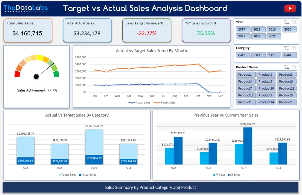
The Dashboard sheet is where the magic happens, with interactive elements for a Comparative Sales Analysis experience. This sheet contains all the charts, slicers, cards and tables used to create the interactive Sales vs. Target Dashboard in Microsoft Excel.
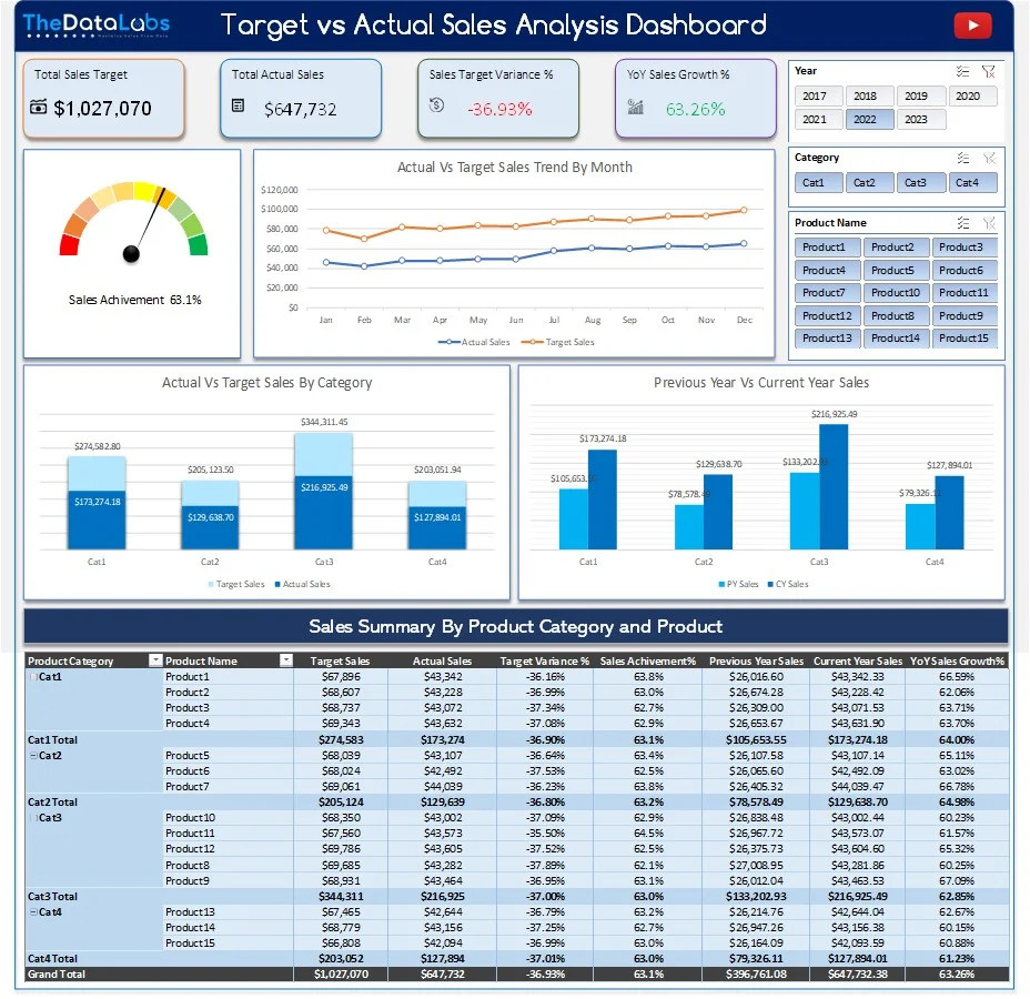
On top, we have a header with the text “Target Vs Actual Sales Analysis Dashboard” which gives a brief explanation of the dashboard.

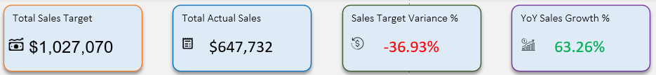
Below the header, there are four Cards which are showing ‘Total Sales Target’, ‘Total Actual Sales’, ‘Sales Target Variance’, ‘YoY Sales Growth %’. These cards give the overview of Sales performance for the selected Year, Category and Product Name in Slicers.
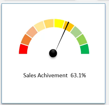
Below these cards, there is a beautiful Speedometer chart which is showing the actual Sales Achievement %. This helps you to understand how Sales are performing against the Target.
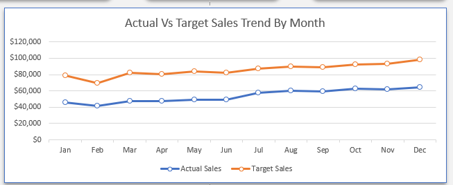
On the right side of the Speedometer chart, there is a Line chart to show the comparison trend of ‘Actual Sales’ and ‘Target Sales’ by month. This chart will help you in analyzing the sales trend and you will know how the sales is performing month on month.
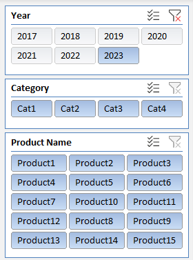
On top right corner of the dashboard, there are three different slicers available for Year, Category and Product Name. You can use these slicers to slice or dice the data in this dashboard to see the sales performance on different dimensions.
Coming to the middle section of the Comparative Sales Dashboard, we have two different charts showing ‘Actual Vs Target Sales’ and ‘Previous Year vs Current Year Sales’ by ‘Category’ and ‘Product’. Both the charts are clickable hence these charts are interactive, and you can use it to drill-down at product level to see the performance of any of the categories. It will also help you in filtering the rest of the Cards, Charts and Table available in this Comparative Sales Dashboard.
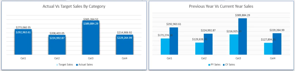
How to use drill-down features in these charts?
To drill-down, just select any of the category columns in both the charts and right click on the selected column and then click on Drill-down to the next level in pop-up menu. It will further expand the selected category to the product level and show the details by product for that specific category. It will also filter entire cards, charts and tables for the selected category.
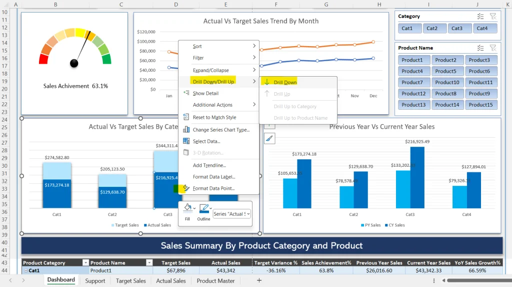
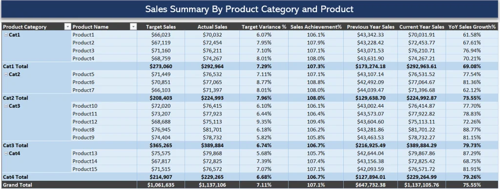
On the bottom side of the comparative sales analysis dashboard, there is a table showing sales summary by ‘Category’ and ‘Product’. Here, you can see the ‘Target Sales’, ‘Actual Sales’, ‘Target Variance %’, ‘Sales Achievement %’, ‘Previous Year Sales’, ‘Current Year Sales’, ‘YoY Sales Growth %’ by ‘Category’ and ‘Product Name’.
Conclusion – Comparative Sales Analysis Dashboard
This interactive Comparative Sales Analysis dashboard empowers users to analyze sales performance effortlessly. You can use this dashboard as a template and just update the ‘Product Master’, ‘Actual Sales’ and ‘Target Sales’ tables with your sales data and refresh the dashboard to see your sales performance.
You can purchase the Comparative Comparative Analysis (Sales vs. Target Dashboard in Microsoft Excel) after clicking on the below button.
We are looking for your feedback and suggestion on this Comparative Sales Analysis Dashboard in Microsoft Excel. Please post your comment here and our team will reply to you. Thanks!
Interested in learning VBA automation and want to develop fully automated data entry form in MS Excel and VBA. Read these step-by-step tutorials.
1. Easy-To-Follow: Create a Fully Automated Data Entry Userform in Excel and VBA in 5 Easy Steps – TheDataLabs
2. Advance Data Entry Form – TheDataLabs
3. Data Entry Application in Excel and Access – TheDataLabs
4. Automated Student’s Registration Form in Excel and VBA – TheDataLabs
5. Employee Activities Tracker – TheDataLabs
6. Employee Activities Tracker version 2.0 – TheDataLabs
7. Data Entry Form – TheDataLabs


