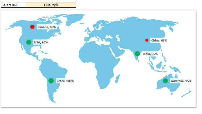
Map Chart is one of the best way to visualize a specific Key Performance Indicator (KPI) in a Dashboard or report. It helps us in showing the KPI performance across multiple geographical locations for a selected category: for example, year, product or company etc.
The latest version of Excel (Excel 365 and the latest updates for Excel 2016) have a built-in feature to insert a Map Chart (powered by Bing) in a Workbook.
The advantage of Bing maps is that you can quickly create a map chart after following the some steps and that do not require any additional charting hacks. However, a very big disadvantage is you need to accept that your data is send to Bings. Sometimes, we work with vulnerable data and cannot share or disclose the information. In addition, many people are still on the old version of Excel and to use the inbuilt Map chart you must have latest Excel version on your machine.
In this tutorial, we will learn the techniques, which will work on any version of Excel. We will utilize a inbuilt Bubble Chart to create a dynamic Map chart and visualize the KPIs by country.
Wold Map link
Image by Clker-Free-Vector-Images from Pixabay
https://pixabay.com/vectors/world-map-earth-global-continents-306338/#
Please watch the YouTube tutorial to learn How to create dynamic map chart in Excel.
Click on download button to download the Excel file used in this tutorial.


