Dynamic 3D Glass Fill Infographics
In this post, we will learn how to create Dynamic 3D Glass Fill Infographics in Excel. This is very beautiful chart and you can use it in dashboard and reports to present the performance% against the target. This is one of the best substitute of 100% Stacked Column and Target vs. Actual chart in Excel.
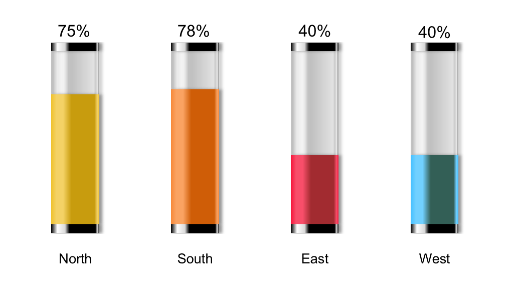
Below is the snapshot of Dynamic 3D Glass Fill Infographics.
Let’s create this chart from scratch.
Please follow the below steps to create this chart in Excel.
- Open Excel application and save it as 3D Glass Fill Infographics
- Rename this ‘Sheet1’ to ‘Infographics’
- Prepare the actual raw data

- Make the duplicate of the above dataset and modify as per below charts

- As we have already Zone and Sales% columns in actual data-set, we need to add 3 more columns in the table. Please refer the below mentioned modified table and replicate the same in Excel sheet

- Select the modified table and go to Insert Tab then select ’100% Stacked Column’ from 2D Column chart

- Now, right click on Chart and click on ‘Select Data…’. In ‘Select Data Source’ dialog box, click on ‘Switch Row/Column’ and then click on ‘OK’

- Delete ‘Chart Title’, ‘Legend’, ‘Gridlines’ and ‘Vertical Axes’ from the chart. Chart will look like the below one after deleting these elements

- Right click on ‘Bottom Cap’ series and click on ‘Format Data Series…’

- In ‘Format Data Series’ pane, click on ‘Fill & Line’ (paint bucket icon) then expand the ‘Fill’ and select ‘Gradient fill’, ‘Type’ as ‘Linear’ and ‘Direction’ as ‘Linear Right’

- Now, set the 7 ‘Gradient stops’, their positions, colors and transparency as per below table
Gradient Stops Color Position Transparency 1st Black Text 1 0% 0% 2nd White Background 1 11% 0% 3rd White Background 1 Darker 15% 29% 0% 4th Black Text 1 38% 0% 5th Black Text 1 92% 0% 6th White Background 1 Darker 15% 96% 0% 7th Black Text 1 100% 0% - Post applying the Gradient’s settings, chart will look like the below one

- Now click on ‘Top Cap’ series and select the ‘Gradient Fill’ to apply the previously applied settings to selected series (Excel will automatically apply the previous settings)

- Now, click on ‘Sales%’ series (filled with orange color in above) then go to ‘Format Data Series’, Click on ‘Fill & Line’ and select ‘Gradient fill’
- Set the 7 ‘Gradient stops’, their positions and transparency as per below table
Gradient Stops Color Position Transparency 1st RGB# 240 - 194 - 45 0% 0% 2nd RGB# 244 - 210 - 102 11% 0% 3rd RGB# 244 - 210 - 102 25% 0% 4th RGB# 200 - 156 - 14 42% 0% 5th RGB# 200 - 156 - 14 90% 0% 6th RGB# 244 - 210 - 102 96% 0% 7th RGB# 240 - 194 - 45 100% 0% 
- Post applying the Gradient’s settings on ‘Sales%’ series, chart will look like the below one

- Keep the color of ‘Sales%’ of North as it is. Change the gradients color of ‘Sales%’ series of South, East and West as per RGB colors available in below table
Gradient Stops North South East West 1st RGB# 240 - 194 - 45 RGB# 248 - 137 - 56 RGB# 246 - 20 - 58 RGB# 69 - 192 - 255 2nd RGB# 244 - 210 - 102 RGB# 250 - 163 - 98 RGB# 248 - 78 - 106 RGB# 113 - 208 - 255 3rd RGB# 244 - 210 - 102 RGB# 250 - 163 - 98 RGB# 248 - 78 - 106 RGB# 113 - 208 - 255 4th RGB# 200 - 156 - 14 RGB# 207 - 93 - 7 RGB# 162 - 43 - 48 RGB# 51 - 95 - 186 5th RGB# 200 - 156 - 14 RGB# 207 - 93 - 7 RGB# 162 - 43 - 48 RGB# 51 - 95 - 186 6th RGB# 244 - 210 - 102 RGB# 250 - 163 - 98 RGB# 248 - 78 - 106 RGB# 113 - 208 - 255 7th RGB# 240 - 194 - 45 RGB# 248 - 137 - 56 RGB# 246 - 20 - 58 RGB# 69 - 192 - 255 - After applying gradients color to ‘Sales% series for South, East and West Axes, chart will look like the below one

- Now, click on ‘Empty Glass’ series in chart (filled with dark gray color in above graph) then go to ‘Format Data Series’, Click on ‘Fill & Line’ and select ‘Gradient fill’
- Set the 7 ‘Gradient stops’, their positions, colors and transparency as per below table
Gradient Stops Color Position Transparency 1st Black Text 1 4% 76% 2nd White Background 1 13% 86% 3rd White Background 1 Darker 15% 20% 100% 4th Black Text 1 36% 80% 5th Black Text 1 89% 92% 6th White Background 1 Darker 5% 96% 42% 7th Black Text 1 100% 73% - After applying the gradients stops, color, positions and transparencies, chart will look like the below one

- Select the Horizontal Axes, change the Font name as ‘Browallia New’; Font size to 20 and Font color to Black

- Select the ‘Upper Cap’ series then click on plus icon (available at the top right corner of the chart) then tick the Data Labels and select ‘Inside Base’

- Right click on Data labels then click on ‘Format Data Labels…’
- In ‘Format Data Labels’ pane, select the ‘Value From Cell’ and select the range of ‘Sales%’. Deselect the ‘Value’ and ‘Show Leader Line’ then close the ‘Format Data Labels’ pane

- Now, select the data labels again, change the Font name as ‘Browallia New’; Font size to 24 and Font color to Black

- Select ‘No Outline’ for Horizontal Axes and Chart from the ‘Format Tab’ in ‘Shape Styles’ group

- Now, our chart is ready, and the final chart will look like below one


Please click on below button to download the 3D Glass Fill Infograpics.