Trending Now


Trending Articles
- All
- Blogs
- Charts and Visualization
- Dashboard & Report
- Data Entry Form
- DAX Tips & Tutorial
- Excel Automation
- Excel Dashboard
- Excel Tips and Tricks
- Excel Tutorial
- Google Sheets
- Google Sheets
- MS Excel
- MS Excel
- MS Excel & VBA
- MS Word
- Power BI
- Power BI
- Power BI Dashboard
- Power BI Tips
- Python Tutorial
- Ready-To-Use VBA code
- Templates & Trackers
- Utility Tools
- VBA Code Samples
- VBA Programming
- VBA Tutorials
More

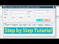
Easy-To-Follow: Create a Fully Automated Data Entry Userform in Excel and...
Step-by-Step Tutorial to create a fully automated data entry UserForm in Excel using VBA. Learn how to set up a database, add a launch button, and insert a user form and module to automate submission and reset.
")
How To Create an Automated Data Entry Form in Google Sheets:...
Google provides a default data entry form that is a Google Form. It can be utilized for a basic data entry job. When it comes to complex and large scale of data entry works, it is always preferable to develop an Automated Data Entry Form to make the task user friendly and improve accuracy & speed.


Latest Articles
- All
- Blogs
- Charts and Visualization
- Dashboard & Report
- Data Entry Form
- DAX Tips & Tutorial
- Excel Automation
- Excel Dashboard
- Excel Tips and Tricks
- Excel Tutorial
- Google Sheets
- Google Sheets
- MS Excel
- MS Excel
- MS Excel & VBA
- MS Word
- Power BI
- Power BI
- Power BI Dashboard
- Power BI Tips
- Python Tutorial
- Ready-To-Use VBA code
- Templates & Trackers
- Utility Tools
- VBA Code Samples
- VBA Programming
- VBA Tutorials
More
Python Introduction

Python Introduction - What is Python?What can Python do?Major Applications developed using Python:Features of PythonFlavors of PythonPython Introduction - What is Python?Python is a general-purpose programming language, and it was developed by Guido Van Rossum in the year 1991. Initially, Python was introduced as...
Unlock Efficiency: # 1 Call Center Performance Dashboard in Excel

Introduction - Call Center Performance DashboardWhat is a Call Center Dashboard?Why Do We Need a Call Center Dashboard?Why use a Call Center Performance Dashboard in Excel?Call Center Dashboard ExampleKPIs in Call Center Performance DashboardStructure of the Call Center Performance DashboardUnderstanding Call Center Performance DashboardExecutive...
Mastering Comparative Sales Analysis – Sales vs. Target Dashboard in Microsoft Excel with 3 Easy Steps

Introduction - Comparative Sales AnalysisYouTube TutorialComparative Sales Analysis Dashboard StructureUnderstanding Data Model and Metrics CalculationLoading and Creating TablesData Modeling in Power PivotMetrics Calculation in DAXUnderstanding Comparative Sales Analysis DashboardConclusionIntroduction - Comparative Sales Analysis (Sales vs. Target Dashboard in Microsoft Excel)In the fast-paced world of...
Automated Daily Activity Tracker in Excel: No. 1 Premium Tool
Introduction to Automated Daily Activity TrackerWatch YouTube Tutorial for Automated Daily Activity TrackerUnderstanding the structure of Automated Daily Activity Tracker'Support Data' Sheet'Master List' Sheet'To-Do List' SheetUsing the Automated Daily Activity TrackerBuy this tool at an affordable price.Buy this tool at an affordable price.Introduction to...
Watch Our YouTube Tutorials
Fully Automated Data Entry User Form in Excel - Step By Step Tutorial
35:41
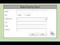
How to Create a Data Entry Form in Excel With Add, Modify, Delete and Reset (Step-by-step Guide)
01:25:36
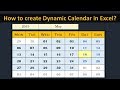
Creating Dynamic Calendar in Worksheet (No Macro) - Simple and Easy
17:36
How to make Macro enabled Form in Excel Sheet?
17:49
Archieves

Backstage view
What and where is Backstage viewYou can access the Backstage view post clicking on File tab.The Office Backstage view is where you manage your...

Boost Your Productivity with 16 Essential Excel Keyboard Shortcuts Every User Should Know
Using Excel Keyboard shortcut keys is the best best way to increase your productivity. You can save valuable time while performing tasks on MS Excel. Using the mouse to do all the tasks reduces your productivity. Hence, we will recommend you to use Excel Shortcuts rather than mouse.
In this page, we are providing the list of Excel Keyboard Shortcuts so that you can refer it and start using them in your day-to-day activities while working on Microsoft Excel.

Calculating Change %
Calculating Change %
By saying change %tage – we essentially mean that the percentage of increase or decrease of a number from its original value to a new value.To calculate the increase percentage: First: get the difference (increase) between the two numbers you are comparing. Then: divide the increase by the original number and multiply the answer by 100.If your answer is a negative number, then this is a percentage decrease.Calculating Change % in MS ExcelLet’s understand how to calculate this in MS Excel.Suppose we have a number ‘X’ which has changed to a new value called ‘Y’, then the change % would be calculated as under:

Common Charts and Usage
What Are Common Chart Types and Where to Use Them?Charts provide a visual representation of your data, making it easier to analyze. In this below post, we will learn about some basic common charts and where to use them.LINE GRAPHA line chart or line graph is a type of chart which displays information as a series of data points called 'markers' connected by straight line segments. It is a basic type of chart common in many fields. It is similar to a scatter plot except that the measurement points are ordered (typically by their x-axis value) and joined with straight line segments. A line chart is often used to visualize a trend in data over intervals of time – a time series – thus the line is often drawn chronologically. In these cases they are known as run charts.Line graphs are used to track changes over short and long periods of time. When smaller changes exist, line graphs are better to use than bar graphs. Line graphs can also be used to compare changes over the same period of time for more than one group.

What is Dashboard
The term dashboard originates from the automobile dashboard where drivers monitor the major functions at a glance via the instrument cluster. It provides all the critical information needed to operate the vehicle at a glance.In the same way, if we talk about BI Dashboard then we refer a single-screen display where all the required visuals and performance graphs are available so that management can get the key information about the business performance and take the decisions. Let’s go through the proper definition and usage of Dashboard.

Mastering Filter Context in DAX and Power BI: 3 Easy Explanation
Understanding Evaluation Context in DAX
In simple language, we can say that the context is the “environment” under which the formula is evaluated. You can think of the evaluation context of a formula as the surrounding area of the cell where DAX evaluates the formula.Context plays an important role in DAX and it enables you to perform dynamic analysis, in which the results of a formula can change to reflect the current row or cell selection and also any related data. Understanding context and using context effectively are very important for building high-performing formulas, dynamic analysis, and for troubleshooting problems in formulas.
Optimize Your Leave Management with Dynamic Annual Leave Tracker in Excel and VBA
Business & Annual Leave Tracker
Business & Annual Leave Tracker is Excel based an automated tool to track and generate leave reports for a team or a function. This tracker is fully customizable and you can make the changes according to your business required. It supports 15 employees and 4 types of leaves. It's totally dynamic in nature and you can change the Holidays list, Weekend details, Employee names and Leave types as per your requirement. It's generate automatic report which shows all the dates against Leave type, Employee name and month.

3D Infographics
3D Infographics Column Chart 3D infographics are the most popular creative trends to remain in the mainstream this year. Among all other charts and visualization design trends in 2019, this particular design concept is increasingly becoming the benchmark today and companies are using these visualization to represents the numbers in Dashboard and Reports.Dashboard designers are continuously exploring modern ideas to meet the needs of their target audience. As Infographics has both the visual and textual elements, it convey the strong message to audience and leave the good impact due to beautiful design of charts.

5 Common Excel Issues & Fixes
Top 5 Common Excel Issues & Fixes
#1. Enabling Fill Handle & Cell Drag-And-Drop
Excel’s Fill Handle is an extremely useful and flexible tool. It can fill or extend a series of numbers, dates or text to the desired number of cells instantly.

Progressive Doughnut Chart
Progressive Doughnut Chart in ExcelThis is Animated Progressive Doughnut Chart made in Excel. This has conditional formatting where it's changing the color of Doughnut and Labels basis the Sales% entered by user. The condition is if Sales% is >=80% then Green, if sales%>=70% and <80% then color will be Amber and if Sales% will be <70% then color will be Red.

3D Glass Fill Infographics
Dynamic 3D Glass Fill InfographicsIn this post, we will learn how to create Dynamic 3D Glass Fill Infographics in Excel. This is very beautiful chart and you can use it in dashboard and reports to present the performance% against the target. This is one of the best substitute of 100% Stacked Column and Target vs. Actual chart in Excel.

Data Entry Form
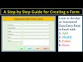
How to Make Macro Enabled Form in Excel Sheet
In this post, we will discuss about an automated data entry form developed in Excel and VBA. This is simple form to demonstrate how can you transfer the data from a form to a worksheet. Using the same type of code and techniques, you can develop a complex form to transfer and collate the data in a Excel Sheet.

Understanding Shrinkage and Calculation
What is Shrinkage and how to calculate it in a BPO industry?Shrinkage can be defined as the time for which people are paid but not available to handle calls or perform their task. In a broader way, we can say that shrinkage is every activity that keeps an agent off the phone for a certain time or day(s). This would include his/her leaves & holidays entitlement, offline activities (training, meeting, coaching etc.), breaks, outbound calling (if any).There are two types of shrinkage in BPO –Planned Shrinkage
Unplanned Shrinkage

Animated Countdown Timer in Excel
How to develop animated Countdown Timer in Excel?Excel provides a lot of flexibility to modify charts and make a lot of good visualization and utility tool. Countdown timer is one of the best examples of Excel based tool. This tool has been created with the combination of Pie and Doughnut Chart. Animation has been added with VBA code. If you are familiar with basic charts and macro, then you can easily create this beautiful utility tool in 5 minutes.

Displaying Chart in a UserForm
How to display chart in a UserForm in Excel?
Excel has no built in control to prepare a chart in Form. If we are doing automation and generating a report then we have to rely on Excel charts. With the help of Image Control and VBA code, we can create a dynamic charts on Excel UserForm.
