Table of Contents
Introduction the Sales Performance Dashboard
A Sales Performance Dashboard is a visual representation of sales data that helps businesses monitor their sales performance and identify trends and patterns. Sales teams can use this dashboard to track key performance indicators, identify areas that require attention, and make data-driven decisions to improve their sales strategies on time.
Creating a Sales Dashboard can be a time-consuming and challenging task, especially for those who don’t have the necessary skills or resources. It involves gathering and organizing data, creating charts and graphs, and presenting the data in a clear and concise way.
TheDataLabs team has created a Sales Dashboard template to make this process easier for businesses. This ready-to-use dashboard is designed to save time and effort and can be easily customized to fit any organization’s unique requirements.
Get insights using this Sales Dashboard
- Analyze the KPIs on the cards to understand overall sales performance.
- Use the slicers to filter the data and analyze sales by product, sales manager, country, year, and month.
- Look at the trend charts to identify sales patterns and track progress over time.
- Use the doughnut chart to see the contribution of each product to the total profit.
- Use the combo chart to compare sales and profit performance by country.
- Identify areas that require attention and make data-driven decisions to improve sales strategies.
Understanding the structure of the Sales Dashboard
The dashboard is made up of three worksheets: Sales Data, Internal Use Only, and Dashboard.
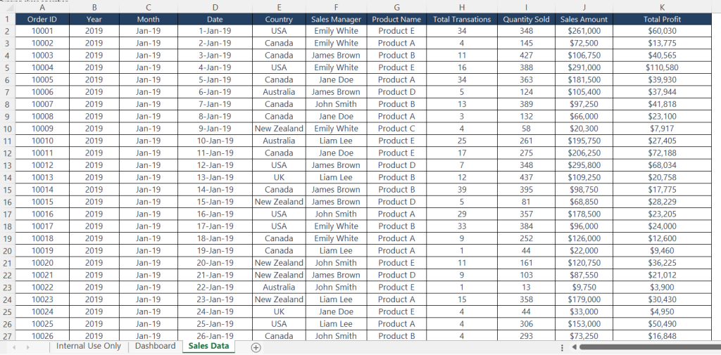
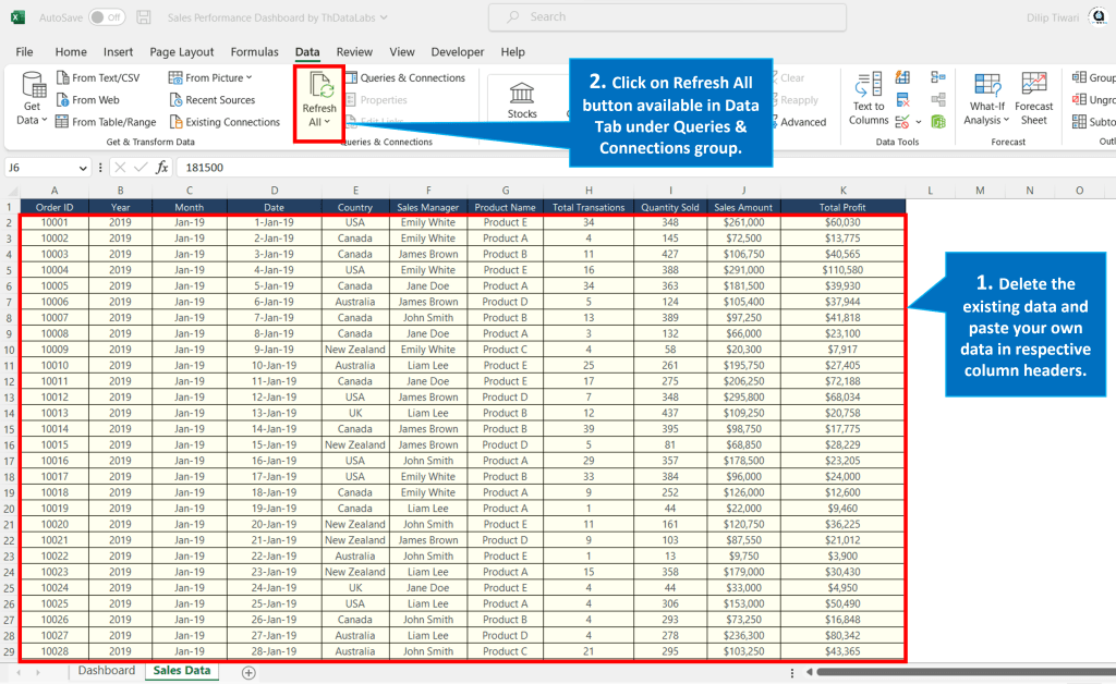
‘Sales Data’ Worksheet
The sales data table has total 11 columns, including details like Order ID, Year, Month, Date, Country, Sales Manager, Product Name, Total Transactions, Quantity Sold, Sales Amount and Total Profit. The data in the table shows sales figures starting from January 2019 to December 2022 for five countries: USA, Canada, Australia, New Zealand, and the UK. It also includes sales figures for five different products named Product A, Product B, Product C, Product D and Product E. Additionally, the data covers the sales figures for five salespeople named Emily White, James Brown, Jane Doe, John Smith and Liam Lee.
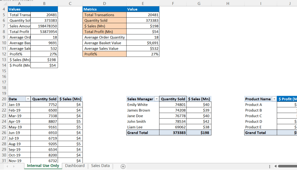
‘Internal Use Only’ Worksheet
The Internal Use Only sheet is only for internal use and contains a Pivot Summary for all the cards and charts available on the Dashboard sheet. This sheet will be hidden as this is not for user and we are referring the details to show visualization in Dashboard.
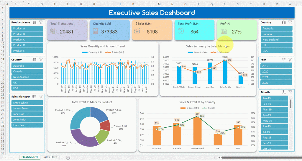
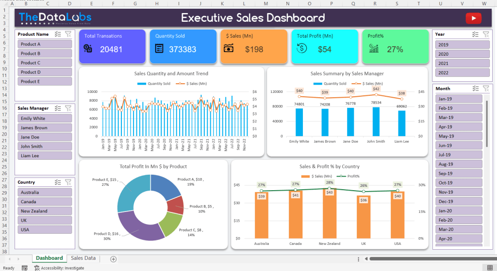
‘Dashboard’ Worksheet
On the Dashboard sheet, you can see a header with branding details e.g., TheDataLabs logo and YouTube link, followed by five cards that show key performance indicators (KPIs) for Total Transactions, Quantity Sold, $ Sales (Mn), Total Profit (Mn), and Profit %.
Below the cards, there are two combo charts. The left chart shows the Sales Quantity and Amount Trend by Month. The column chart presents data for Quantity Sold and the line chart is for $ Sales (Mn). The right chart shows the performance of Sales Managers.
Below the Sales trend chart, there is a beautiful doughnut chart that shows the Total Profit and contribution % by Product. To the right of the doughnut chart, there is a combo chart that shows the Sales and Profit % performance by Country.
To make it easy to filter the data, there are several slicers provided, including slicers for Product Name, Sales Manager, Country, Year, and Month.
How to customize it for your own use?
This is absolutely easy process! In Dynamic Sales Dashboard template, users can simply delete the sample data available in the “Sales Data” worksheet and paste your own data into the appropriate columns and click on ‘Refresh All’ button available in the ‘Data’ tab under ‘Queries & Connection’ group. The dashboard then automatically generates charts and graphs and provides KPIs to help track sales performance. As Sales Performance Dashboard template also includes slicers, you can use to filter and analyze the data by product, sales manager, country, year, and month.
Download Sales Dashboard
You can download the dashboard and start using it right away.

Feedback and Queries
We would greatly appreciate your feedback on this Sales Performance Dashboard, and if you have any queries related to this dashboard or would like to learn how to create it step-by-step, please leave a comment in the section below.
In addition to this tutorial, you can also check out more tutorials on our YouTube channel TheDataLabs to learn about other dashboard templates, automated utility tools, and reports that are available for free and ready-to-use.
Thank you for visiting our site and we hope that our Sales Performance Dashboard can help you monitor and improve your sales performance.


